2023 | Comcast
Optimizing the Search Page Experience on ComcastNow
Using SEO to improve search efficiency, refine filters, and reinforce Comcast’s diverse family of companies.
60%
increase in Engagement
100,000
employees reached
Redefined the focus of phishing scam identification from systems to humans, with an emphasis on how mental models can affect detection capabilities
Gathered establishing data from surveys and likert-scale interview questions
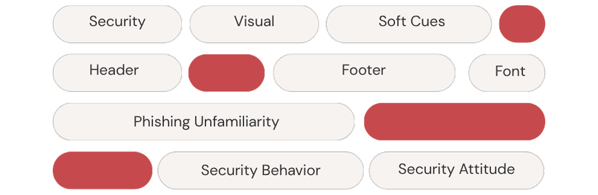
Thematic coding of interviews, affinity mapping, and usability testing of the transfer of trust-building ui elements on the development of a clearer mental model of security
Created trust-building UI elements catered towards building a better mental model of design
Cleaned up HTML/CSS and assured design consistency on our web-app.
This thesis explores how users’ mental models shape their sense of online safety, and how intentional, trust-centered UX practices may prevent deception before it happens. What if the solution to phishing isn’t stricter cyber-security protocols, but better design?

UX Researcher
9 months
Qualtrics, Figma
And they may not even know it. Despite the growing sophistication of phishing scams, most existing anti-phishing solutions rely on either technical detection systems or educational interventions that fail to consider how users actually engage with security cues in real time.
Phishing falls under the broader category of social engineering, which is a combination of deceptive tactics used to manipulate victims. Phishing scammers will impersonate a trusted entity or platform to deceive victims into surrendering sensitive information, often unbeknownst to the victim themselves.
In the age of digital connectivity, phishing has become one of the most persistent and adaptable forms of cybercrime. This research was driven by a central concern: the disconnect between how users perceive digital security and how it is represented or hidden within the interfaces they interact with. While organizations invest heavily in protecting their digital systems from hacks and scams, phishing often bypasses these defenses by targeting the system’s weakest link: the human user.
Furthermore, research within the topic of phishing was limited to certain sectors like finance and e-commerce, with little to none on travel-related phishing scams. With that in mind, it became clear that there was a gap in existing literature that tested and examined the mental models of security people have, and how UX could play into it.
While existing phishing research has explored user behavior, and system defenses, less attention has been paid to how the design of interfaces itself can proactively shape user decision-making and reduce susceptibility.
In 2022, the FTC completed a comprehensive study of the losses reported as scams in the United States and determined that the demographic most likely to fall for scams were actually those that fall within Generation X, Y, and Z, or the 18-59 range. In the academic sphere, there is a touch of disagreement on who is most likely to fall for a scam. While much of the literature on who falls for scams is contradictive, there is more alignment on why people fall for these scams:
Scammers use structured persuasion strategies that mirror social and psychological principles. Authority, especially, is central, but all three tactics are used in combination with each other to gain the trust of the victim.
Current design uses interface encapsulation, hiding complex system functions behind simple visuals. This is great for usability, but in the context of security it backfires. Without clear signals or feedback, users can’t form mental models of what’s safe versus risky. And if they don’t understand what their interface is doing—or not doing—they can’t act defensively.
By centering the experiences of victims and the user themself, the focus is shifted onto the user and what can be done to strengthen their mental model of security. This meant gathering as much quantitative and qualitative data as possible through three different methods:
64 Participants were asked to reflect on what made the scam appear trustworthy initially (e.g., official design, urgency tactics, and branding consistency), and what ultimately triggered suspicion or realization of the scam (e.g., formatting errors, requests for sensitive information, and browser warnings).
Gaining trust is essential to deceiving a victim. That trust is typically found in the visual design of the scam. When assessing whether something online is safe, most users don't dig into URLs or SSL certificates. Instead, they rely on soft cues—visual elements like design, tone, or branding.
Participants with prior travel-related scam experiences or high baseline suspicion often developed their own heuristics, such as evaluating site effort, brand alignment, and interactivity.
Thematic coding revealed that regardless of the type of site they encountered a phishing scam, all users relied heavily on their mental models to determine the legitimacy of a site, and look for recognizable heuristics such as branding and good design to validate that mental model.
The final phase of the study involved a two-part usability test designed to evaluate how users interact with phishing-related content and whether trust-building interface elements influence the development and application of a security-related mental model. (picture of UT structure + demographics of users interview/how many)
If trust building, explainable UI was added to an interface, would it help users identify a scam within a site that is virtually similar in design?
On Day 1, all participants were asked to rate their familiarity with phishing scams and confidence in identifying them before proceeding with the test.
This was followed by an observational task in which they interacted with a mock email inbox containing four real emails and one phishing scam. Without being prompted to look for scams, participants were asked to think aloud as they navigated the inbox, simulating real-world email checking.
Interestingly, all participants were generally skeptical even of legitimate messages, suggesting that a baseline of distrust has become part of users’ digital habits. In the absence of hard cues like URL or security warnings, participants 1 and 2 valued effortful design.
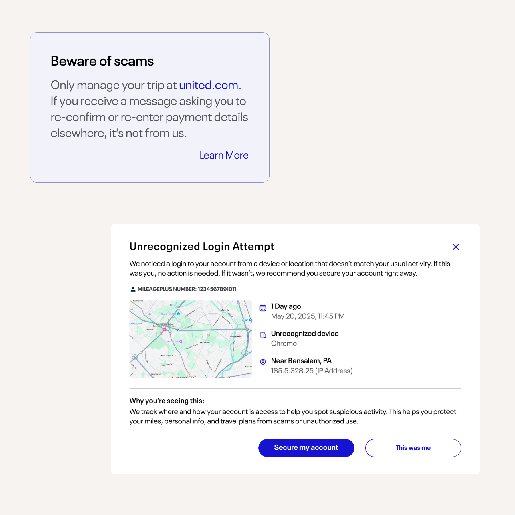
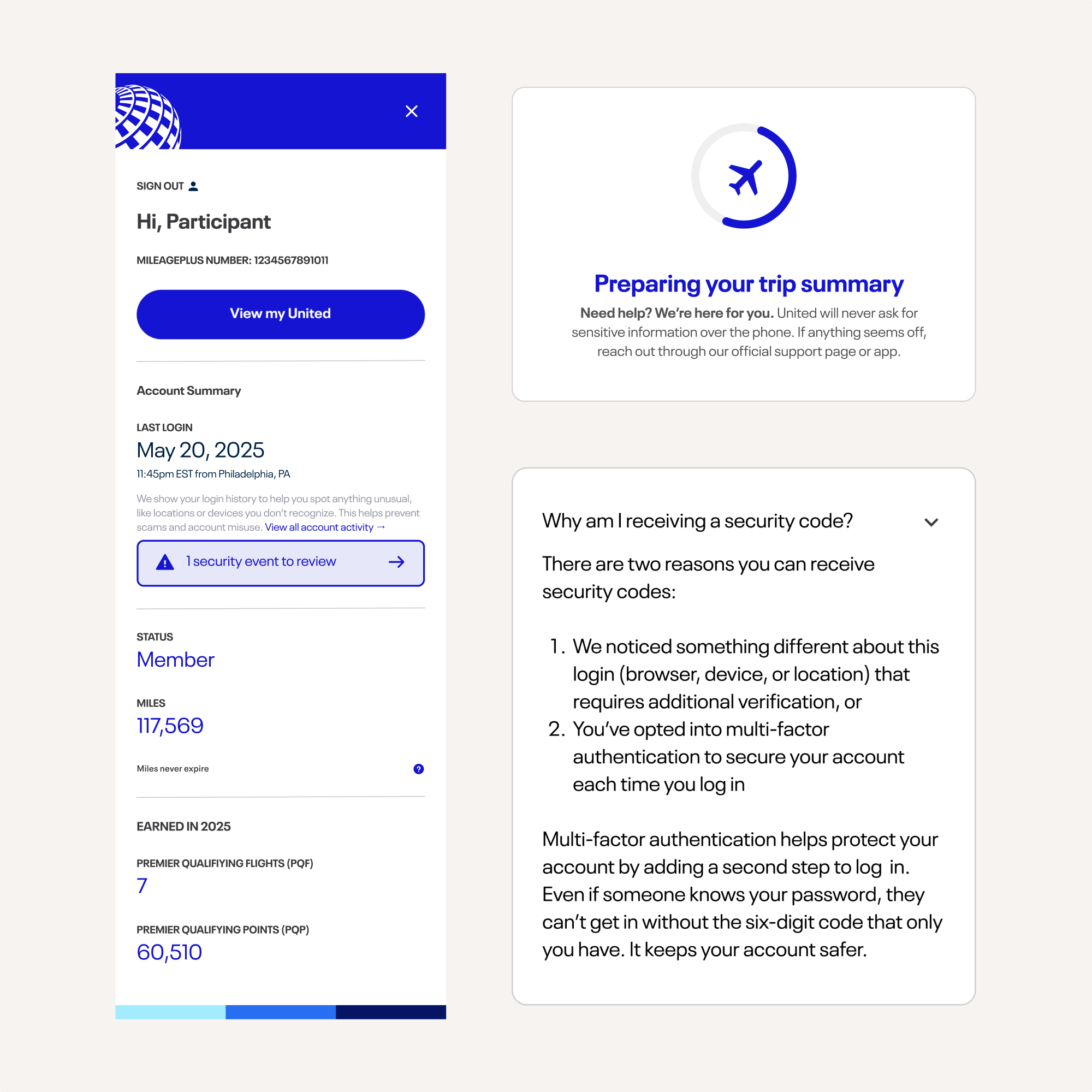
Participants were then tasked to visit the simulated United Airlines booking website with explainable design, branding consistency, and visual elements intended to support user confidence and decision-making.
Participants were asked to evaluate the security of the site and how legitimate it felt. Features like two-factor authentication, visible login history, and personalized account summaries helped users feel the site was genuine.
Non-obtrusive messages throughout the flow warned users of common phishing tactics and reiterated that United would never request sensitive data over the phone. Reactions to this messaging varied, with one participant even showing suspicion for how 'constant' it seemed to appear.
Through observation, I noticed that the participants gravitated towards what felt familiar to them. Participants were pointing out design elements such as clean UI, consistent branding, and good copy as legitimate.
As one user put it:
This sentiment was shared among all participants. But what if someone did go through all of that trouble?
On Day 2, the stakes were a bit higher. Out of 5 new emails, this time, two emails were phishing scams. Participants were encouraged to click on the links of emails they trusted.
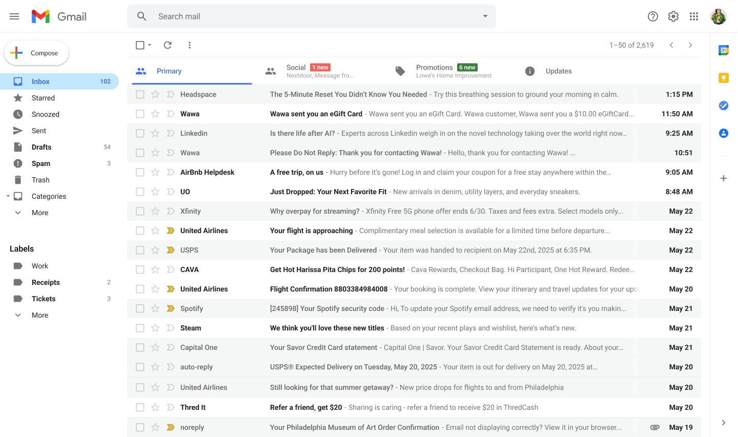
While 3 out of 4 users picked out the red herring Airbnb email as a phishing attempt, all four participants subsequently fell for the United airlines phishing email. The phishing email directed the participants to select the meal for their flight and lead them to a dummy version of the United Airlines site seen in Day 1.

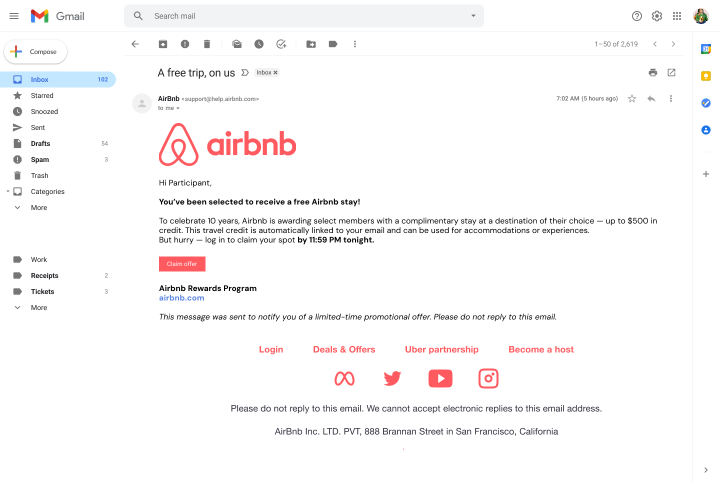
In the email, participants were urged to select their meal before time runs out. This email had a baseline level of design that played into the familiarity that the participants had from day 1. It lacked, however, core elements such as a reputable email sender or flight confirmation number. The footer was also missing information that the participants observed and noted day 1 as an indication of a real email. The tone of the email was urgent, pressuring the user to make a meal selection immediately.
Participants proceeded to evaluate the United site in the same way they did Day 1. Key elements that participants pointed out Day 1 such as 2FA, personalization, and some branding elements were missing from the phishing site.
No participants noted the absence of scrollability in the site, nor the absence of any of the other security processes seen in Day 1, indicating that there was a reliance on the overall familiarity of the site. As long as the design matched to a certain extent, it seemed real. Participants provided their information with little to no question.
These observations and past data reinforce a recurring theme prevalent in the life cycle of phishing scams: users don't fall for scams purely out of ignorance, but rather due to the failure of digital interfaces to expose risks at the right moment. Observing how users interact with a prototype that reflects a security-first approach to the site design and messaging is a step towards understanding the human aspect of phishing scams.
At the end of the session, participants were asked to once again rate their confidence in identifying phishing scams, after being informed of which sites were fake:
Good security design starts with the design of the site. Adopting principles of explainability in the design of a product familiarizes the user with the functions of the site and lays the foundation of a mental model that the user carries with them on their digital journey.