2025 | master's thesis
Improving Mental Models of Security on Travel Platforms
A study on how UI design can shape user perception of trust and security across popular travel sites.
8%
DECREASE IN OVERCONFIDENCE
24%
improvement in scam recognition
Created research plan and oversaw data collection, testing structure, and methodologies used.
Gathered qualitative insights through surveys, interviews, and journey mapping to identify gaps in the subletting process
Led final validation sessions and synthesized insights to confirm improvements in clarity and trust.
Used research data to inform decisions made across low, mid, and high fidelity designs.
Designed & prototyped the sublet filter process and onboarding process
Cleaned up HTML/CSS and assured design consistency on our web-app.
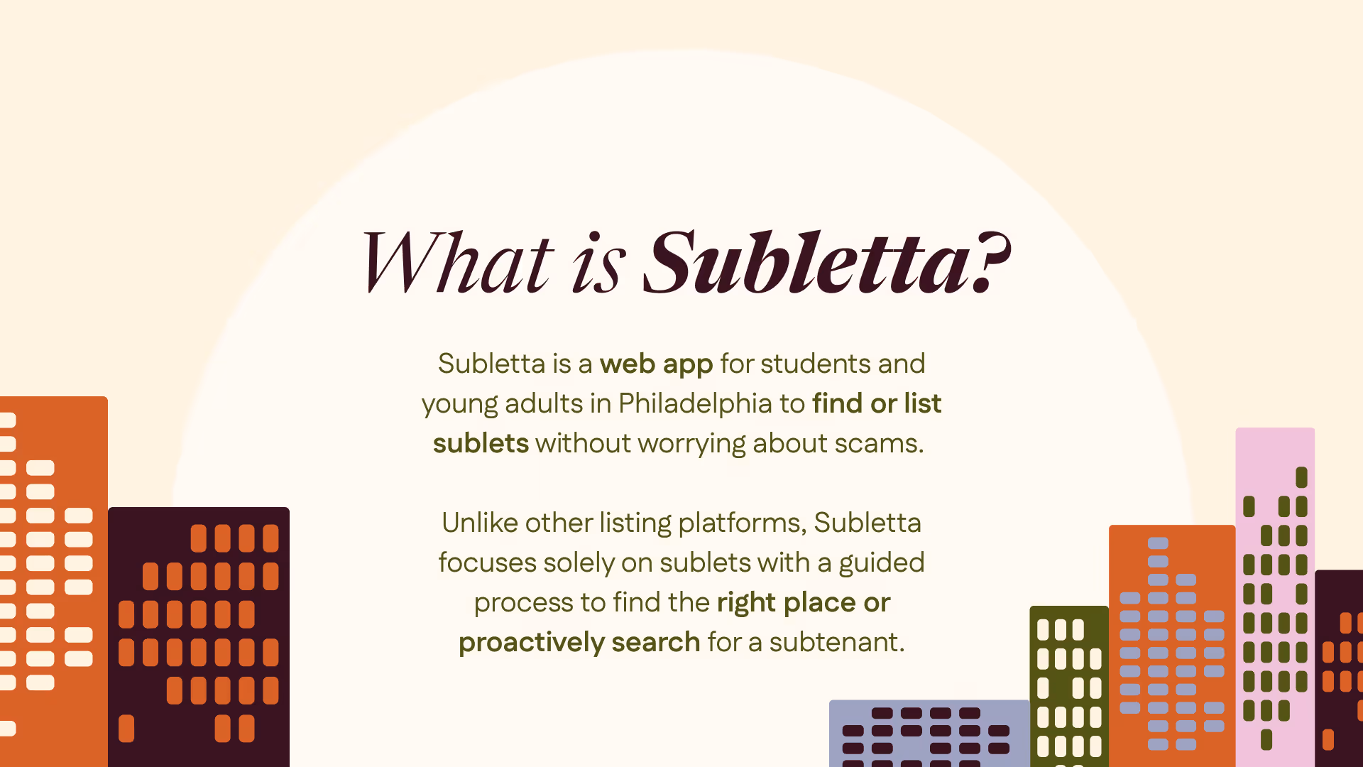
Subletting can be complicated. We aimed to create a platform that could be an answer to the issues students faced while finding short-term housing online.
UX Researcher
9 months
Qualtrics, Figma
In the cracks between, you'll find students juggling short stays, semester breaks, and temporary moves. Sifting through posts on rental platforms, it was clear that there was one major issue that plagued these students: a lack of a dedicated platform catered towards subletting.
Subletta was our answer: a webapp built to make short-term renting safer, simpler, and more transparent. As the UX researcher on the team, I set out to understand what makes subletting feel uncertain and how design could bring confidence back into the process.
To map the landscape, we analyzed existing rental platforms and social spaces where subletting happens. Many of our potential users used a mix of existing rental platforms (AirBnb, Vervo, Zillow), subletting-specific platforms (HousingPanda) and social media platforms (Facebook, Reddit, Instagram) to find a sublet. The first question we asked was, “what issues exist within these current platforms?”.

This helped solidify three main issues with the current landscape:
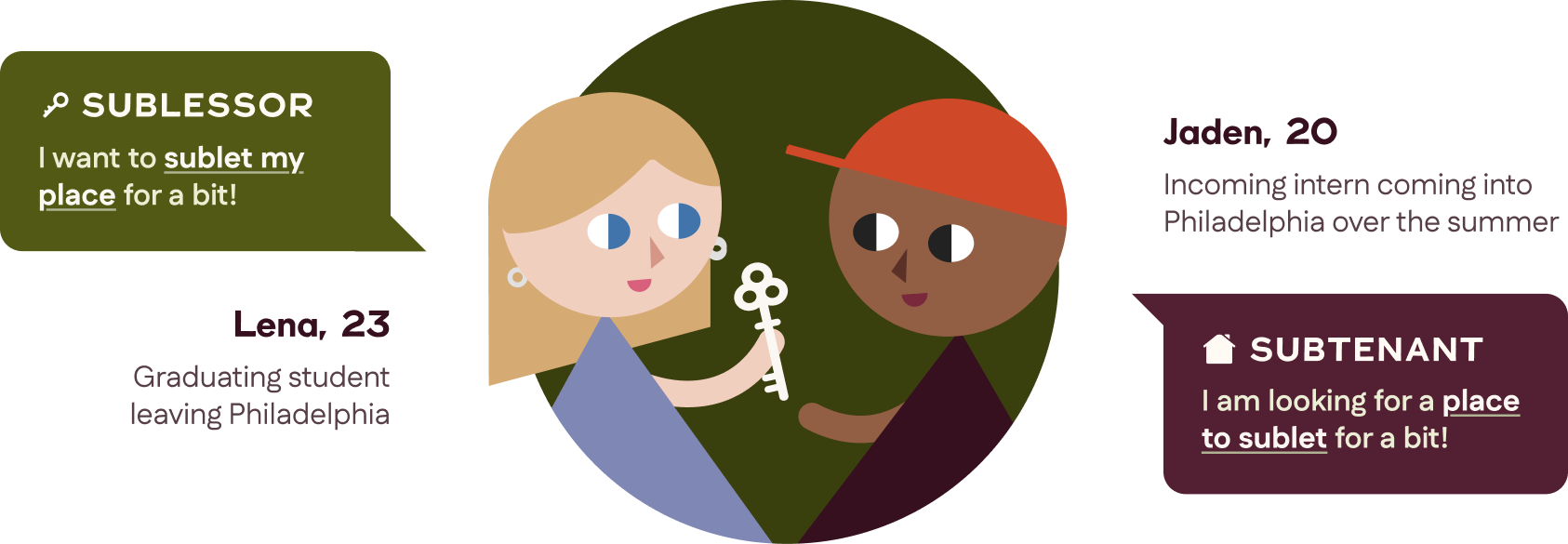
While we began to get an idea of what we should start to focus on, we needed to speak to our users directly to understand their perspective. A simple survey and interview revealed that there were two key user archetypes that filled the roles of sublessor and subtenant.
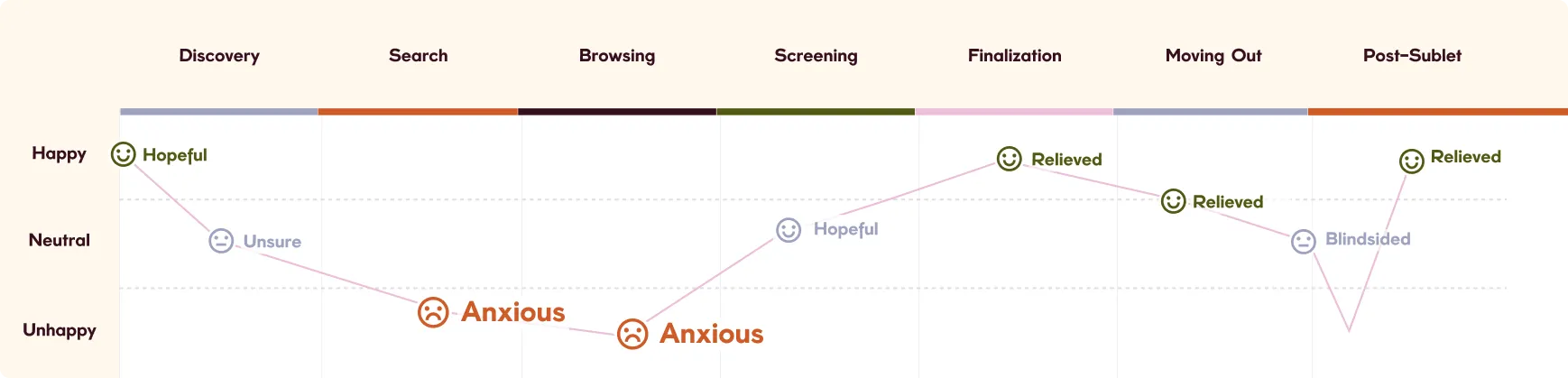
1-on-1 interviews with our users and journey mapping provided us with deeper insight into what made them tick with current subletting platforms. We heard the same words repeated—“uncertain,” “sketchy,” “no clear process”. Many of our users had negative experiences tied to subletting that stemmed from inexperience and the unreliability of online exchanges. In fact, many of the users we interviewed that reported having a positive experience were those who found their sublet offline, through a friend of a friend.
This became one of our guiding goals for Subletta: to replicate that positive experience digitally.
Based on preliminary research results, we prioritized three factors that needed to be addressed in our product to answer this question:
With verified profiles, personalized search tools, and guided support, Subletta helps bring you closer to home, no matter where you go.

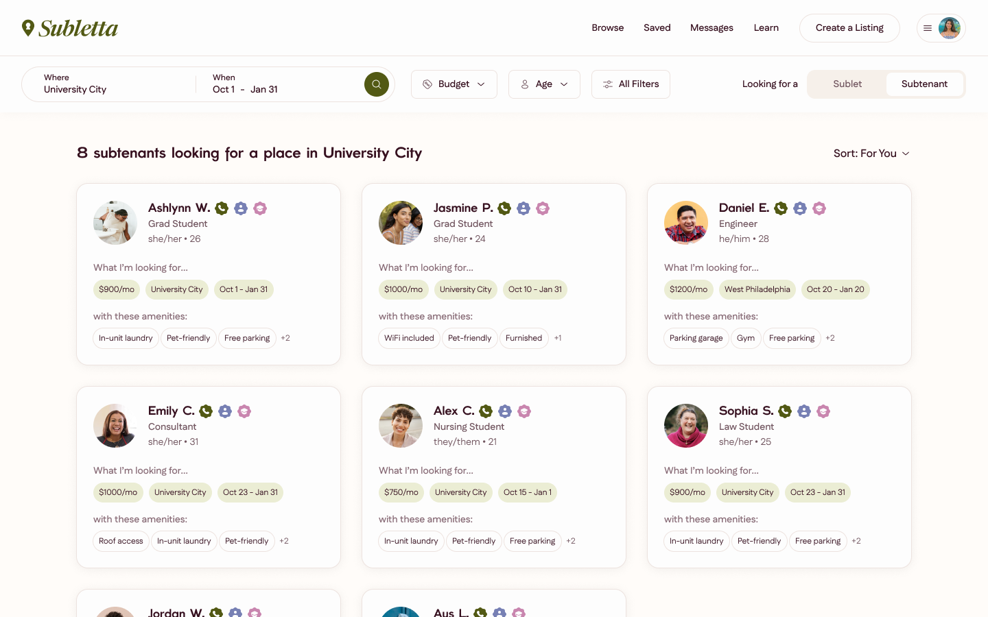
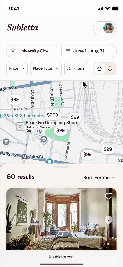
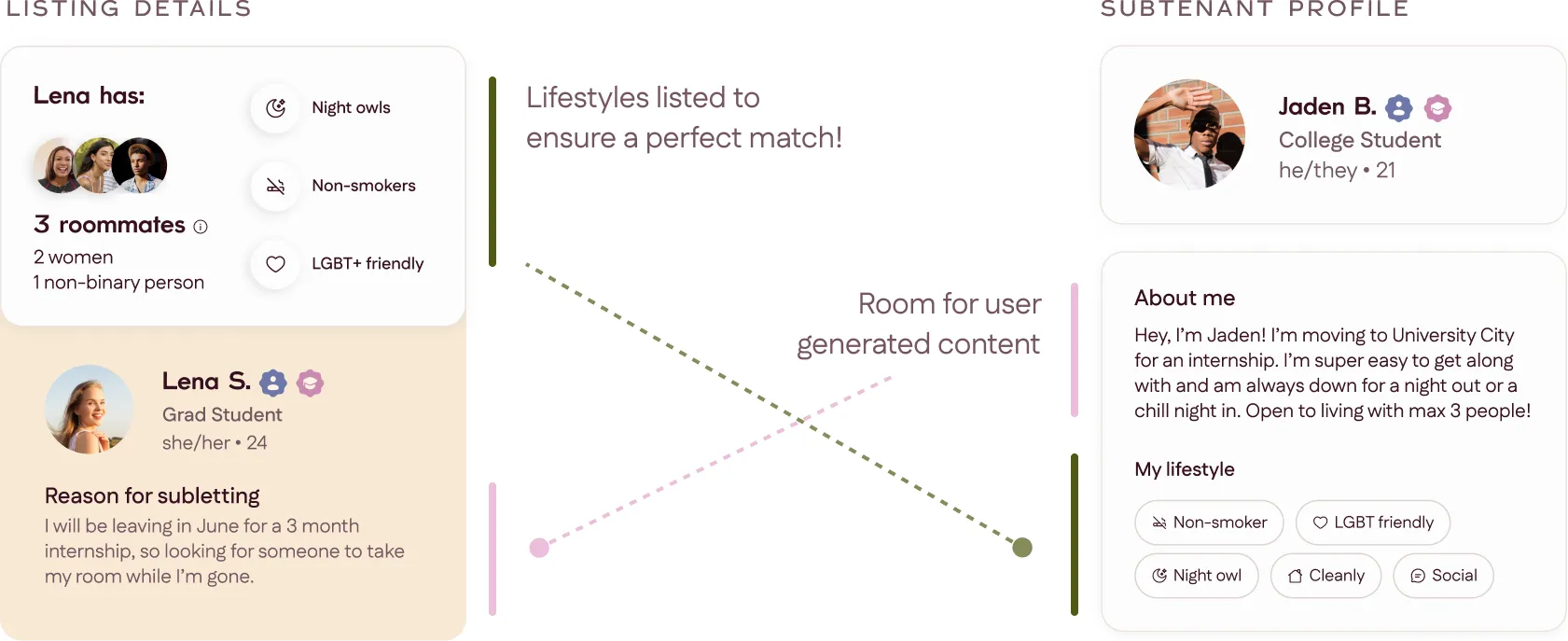
The experience of listing an apartment versus searching for an apartment demanded two distinct paths. Sublessors cared about people; subtenants cared about places. We split Subletta’s experience into a two-way search that allows users to search for people and sublets at the same time.

Early A/B and IA tree testing made it clear that simplicity mattered. Sublet listings are dense with information, so reducing cognitive load via layout and card content hierarchy was essential.
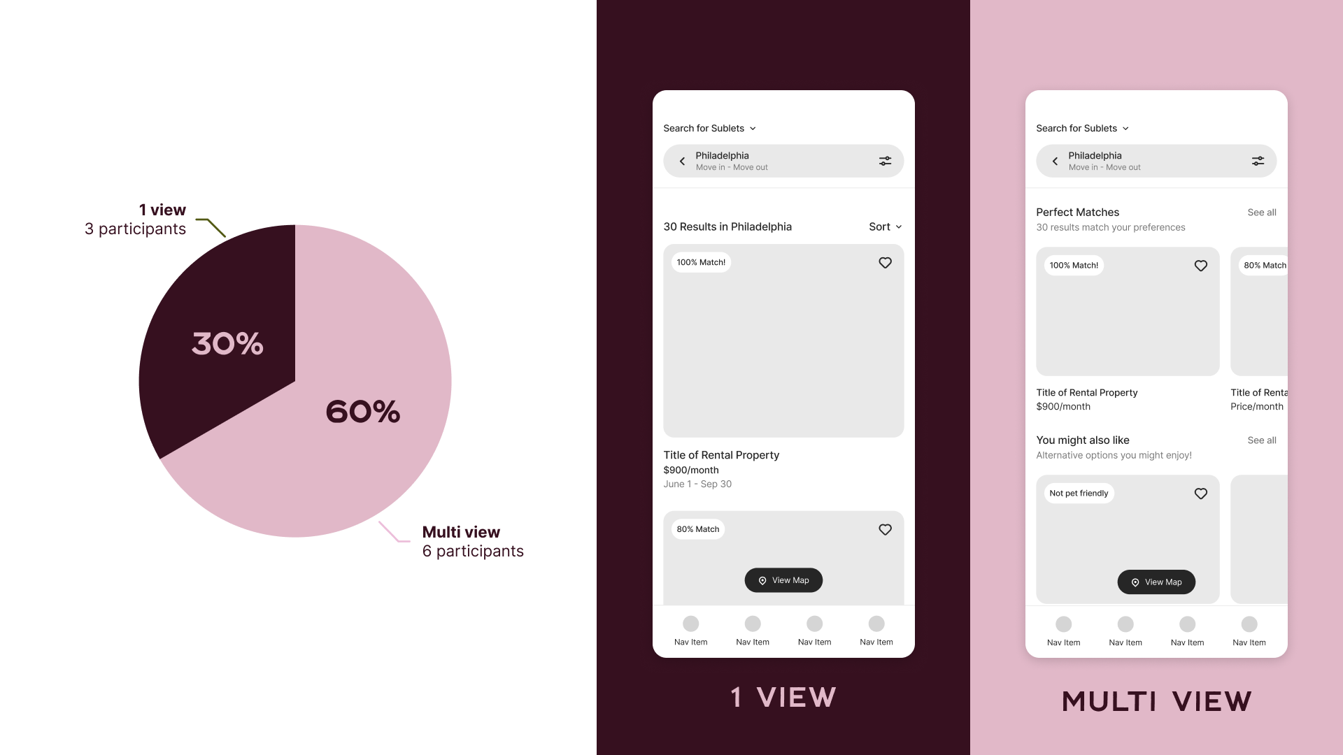
Listings are divided into sections based on the user's search, likes, and filters that can be expanded into and viewed in a vertical list form. Many of our users noted fatigue from scrolling endlessly on listings that were irrelevant or fake on current rental platforms, so we tested out this method with a group of users before fully implementing it into our design. Compared to previous testing, we noticed a 40% increase in satisfaction with the new listing layout.
We designed our profile cards to be more than just names and contact info. On both ends, users can share their interests and lifestyle preferences.
80% of the users we interviewed noted that they had never subletted before their first experience. Many users admitted they had no idea what “subletting” formally involved. The unknown can be daunting; we wanted to make Subletta feel like a friend that guides you through the process of subletting, from start to finish.
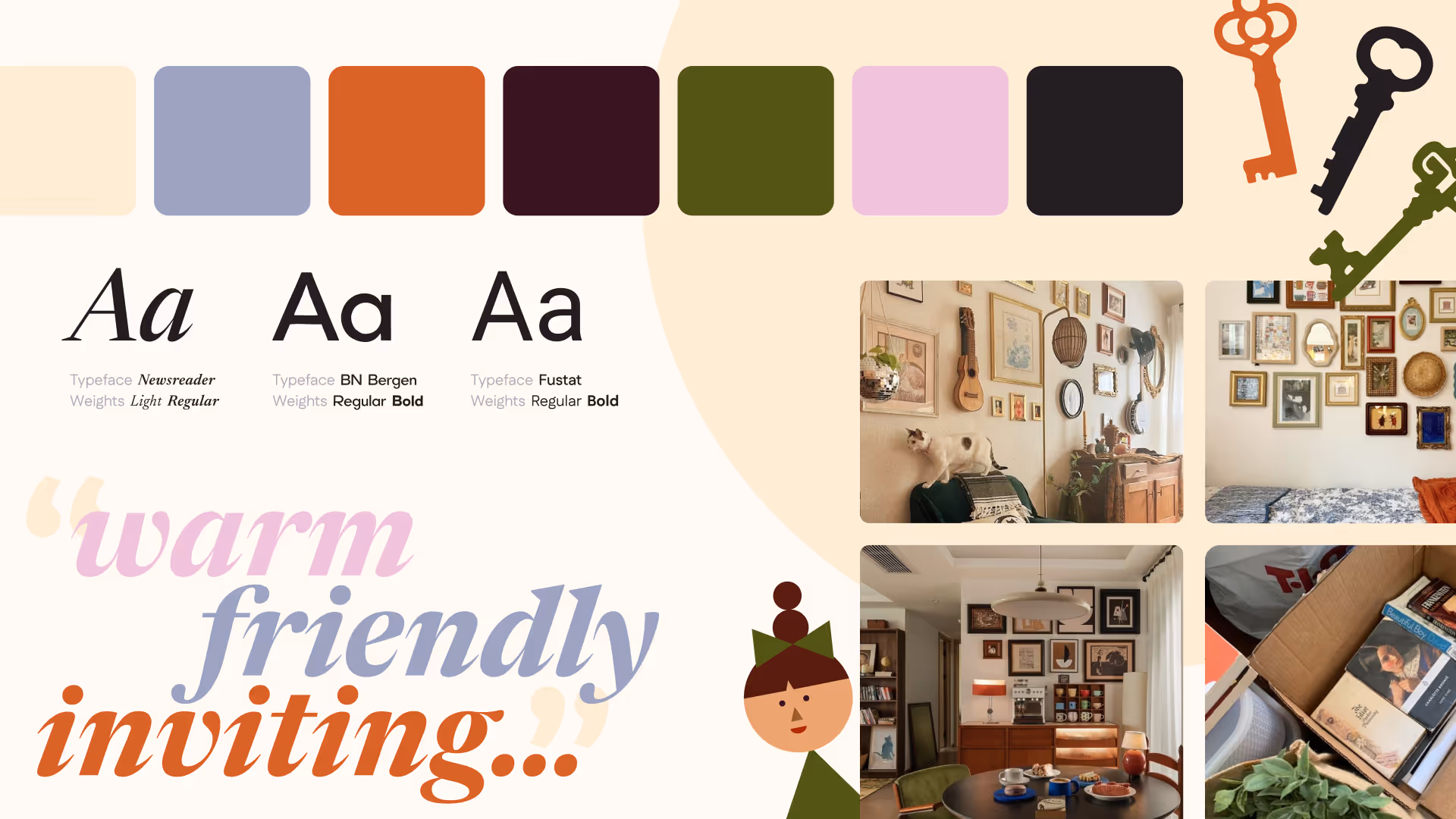
We established that feeling firstly through Subletta’s branding and tone, which offers a warm, inviting vibe with just a touch of nostalgia. Our desirability study further confirmed that the intent came across as we had intended.
Initally, our solution included informative articles meant to guide our users, but usability testing revealed that many of our users gravitated towards diving directly into the interface and search process.
We embraced this by adding in tooltips and helpful, unobtrusive pop-ups meant to guide the user without overloading them with information.

We asked our users what their familiarity with subletting terminology was like prior to designing the onboarding experience. To our surprise, many of our users were confused on the terminology and the name of the respective roles, despite technically having the rote knowledge of what a sublessor and subtenant is. Keeping in mind the goal of unobtrusiveness in our guided approach, we adopted a guiding tone and explanatory structure to our onboarding, that gave our users an introduction to subletting and what a sublessor vs subtenant’s purpose is.
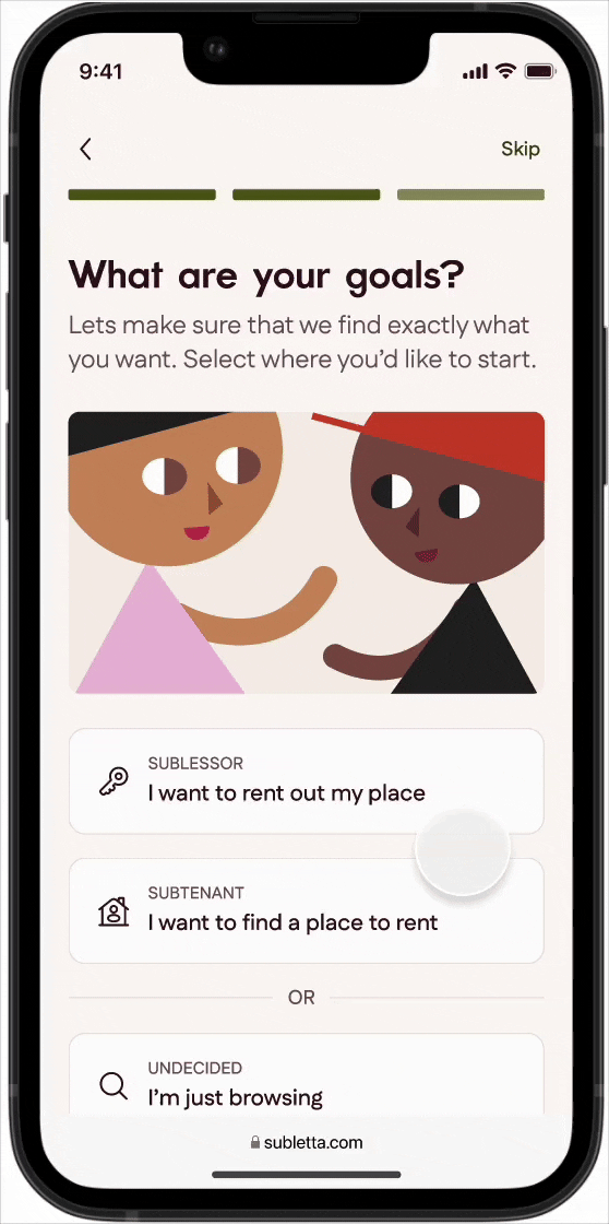
Using visual language to reinforce learning, we ask our users to define their subletting goals.
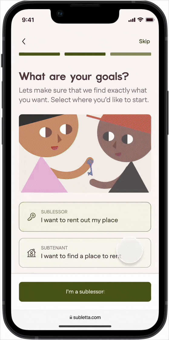
All users need to do is choose; all subsequent information can be inputted anytime at the user’s discretion.
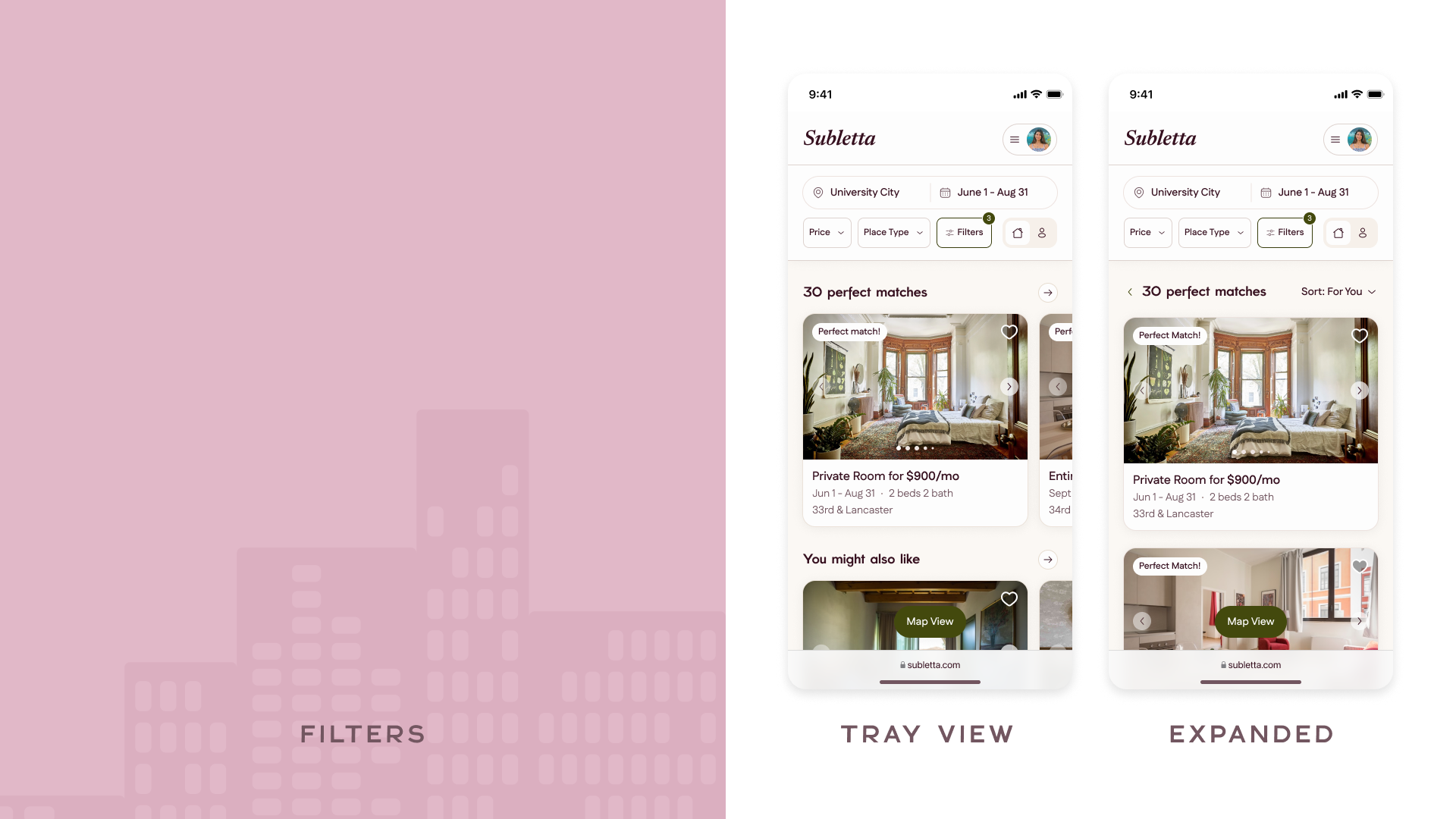
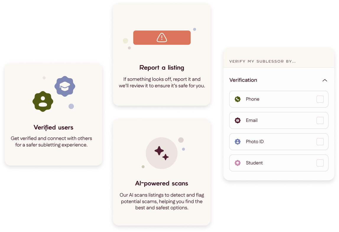
If we had shipped our product into production with our features as is, it would likely fail for one reason: a lack of trust and transparency. Verification badges and searchable status filters gave users a visible layer of safety. Users were able to filter and search by verification status, and badges were displayed directly on users’ profiles as well.
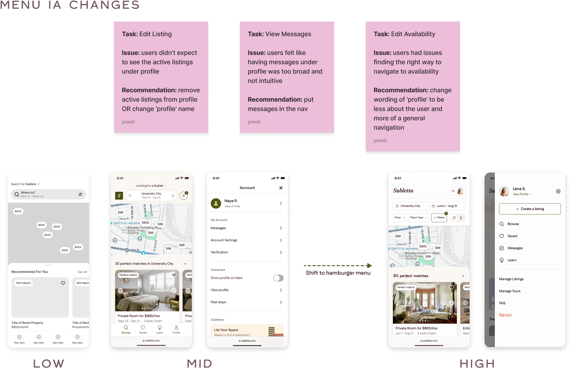
After design handoff to our devs, the focus landed more on observing the interactions with our MVP to determine any critical usability issues and QA the design. There is a difference between testing on static pages versus clickable, live content that we hoped to understand with our MVP testing.
Final usability testing confirmed that the updated navigation, clearer verification cues, and guided tooltips built user confidence, and we launched our MVP with a pretty solid scoring:
During the planning phase, our team brainstormed a long list of potential features for Subletta—many of which didn’t make it into the final product once we refined our scope. At first, I regretted leaving some ideas behind, but in the end, I was glad our MVP focused on solving the problems that mattered most.
What stood out to me most was hearing testers say they wished Subletta had existed when they first started subletting. It would not have been possible without the combined effort of team Subletta! You can check out our website here, or watch our presentation below. .