2025 | subletta
Creating an Intuitive Solution for Short-Term Renting in Philadelphia
Most rental platforms aren't built with subletting in mind. Subletta aims to change that.
20
NET PROMOTER SCORE
3 in 4
FOUND IT EASIER TO FIND A SUBLET
Redefined the focus of phishing scam identification from systems to humans, with an emphasis on how mental models can affect detection capabilities
Gathered establishing data from surveys and likert-scale interview questions
Thematic coding of interviews, affinity mapping, and usability testing of the transfer of trust-building ui elements on the development of a clearer mental model of security
Created trust-building UI elements catered towards building a better mental model of design
Cleaned up HTML/CSS and assured design consistency on our web-app.
Reliable service is the result of consistent training. I advocated for and designed an internal training design system at SEPTA that standardized how eLearning courses were structured, built, and maintained.

Digital Designer
6 months
Figma, Articulate
Behind every trip is a network of training standards, certifications, and operational expectations that prepare operators to perform safely and reliably across routes and conditions. Even small issues in training structure can trickle downstream. The systems that support training are as critical to service quality as the service itself.
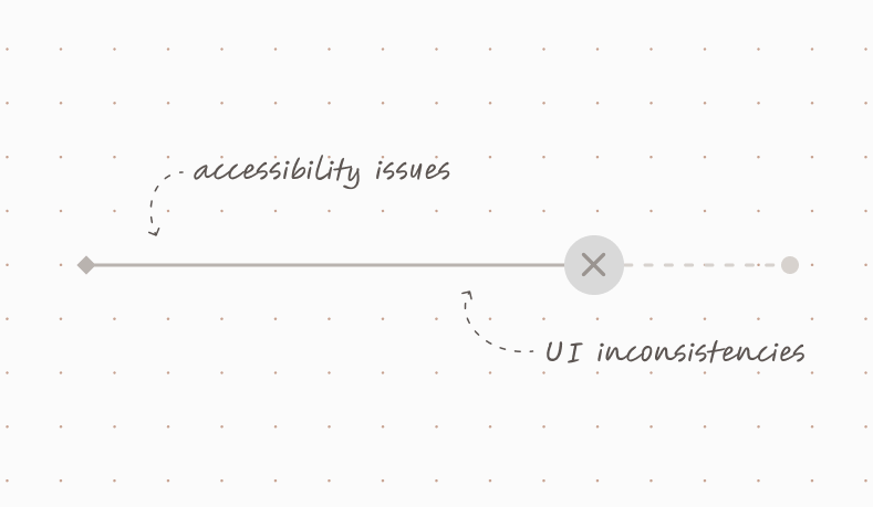
SEPTA employees rely on the training department for compliance training, recertifications, and role-specific education, making its effectiveness critical to day-to-day operations. Since 2020, trainings have transitioned from in-person delivery to digital formats built in Articulate Storyline. These courses were created with unclear branding, and varied in design and structure. A review of the existing eLearning courses surfaced three interrelated problems affecting users, designers, and stakeholders:
Following this shift, training demand increased beyond what a four-person team could sustainably support. The volume of new courses, updates, and recertifications outpaced existing processes, exposing limitations in how content was designed, built, and maintained.
Introducing standardization meant challenging long-standing habits around how courses were designed and built at SEPTA. I advocated for uniform design standards after observing and presenting how inconsistencies manifested across existing courses and how they directly contributed to completion challenges and operational inefficiencies.

These issues highlighted the absence of a shared design system capable of supporting SEPTA’s training needs at scale. Addressing them required more than isolated course fixes and instead called for a standardized framework to guide layout, interaction patterns, and content structure across the eLearning ecosystem.

The look and feel of a course should not be the most time-consuming part of the build process for a learning experience designer. Standardized patterns and components allow designers to focus on instructional quality rather than rebuilding visual structure from scratch.
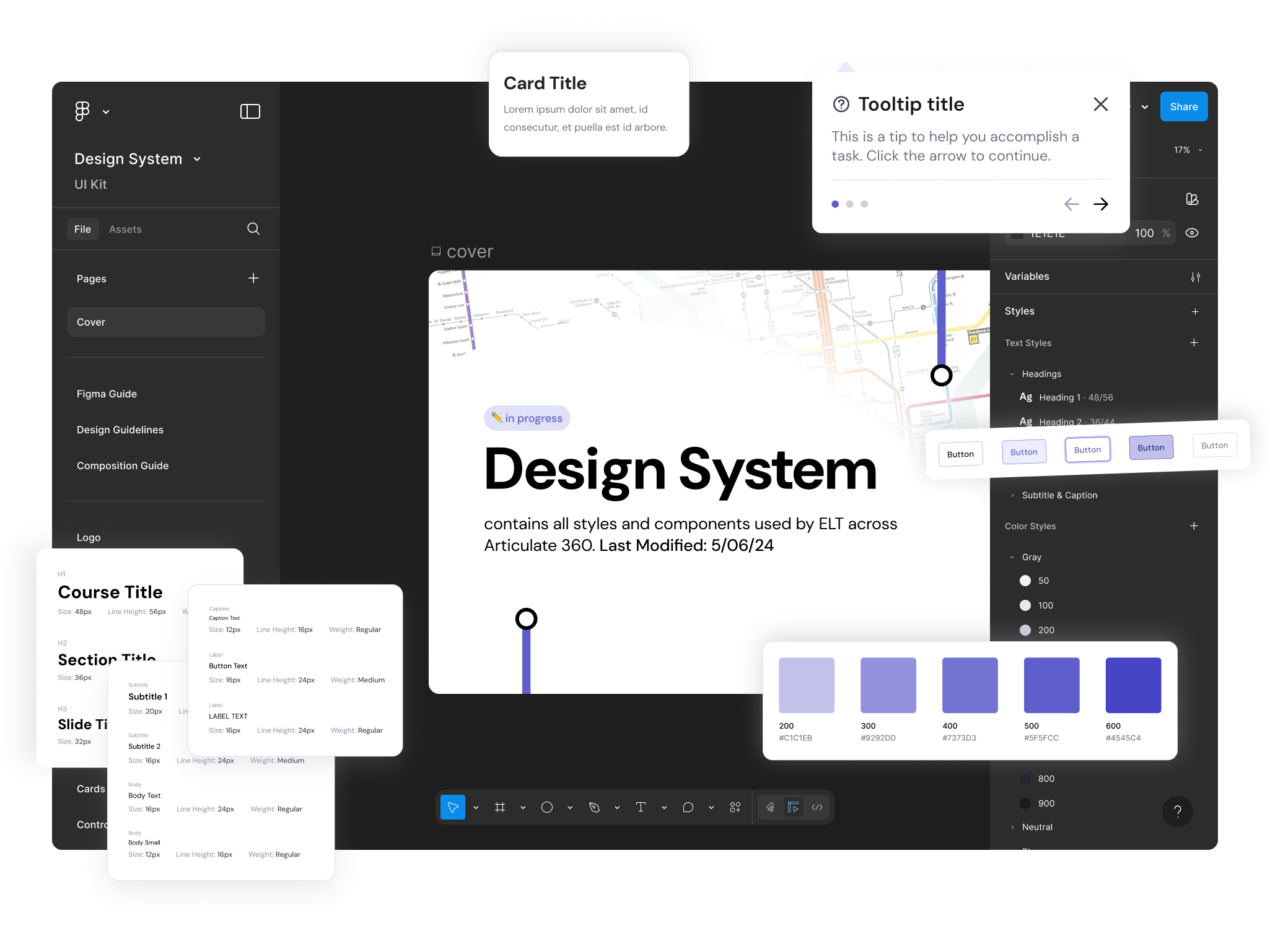
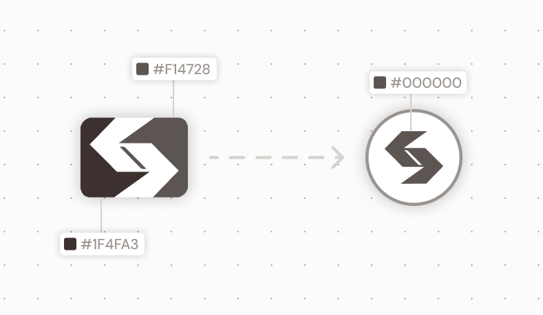
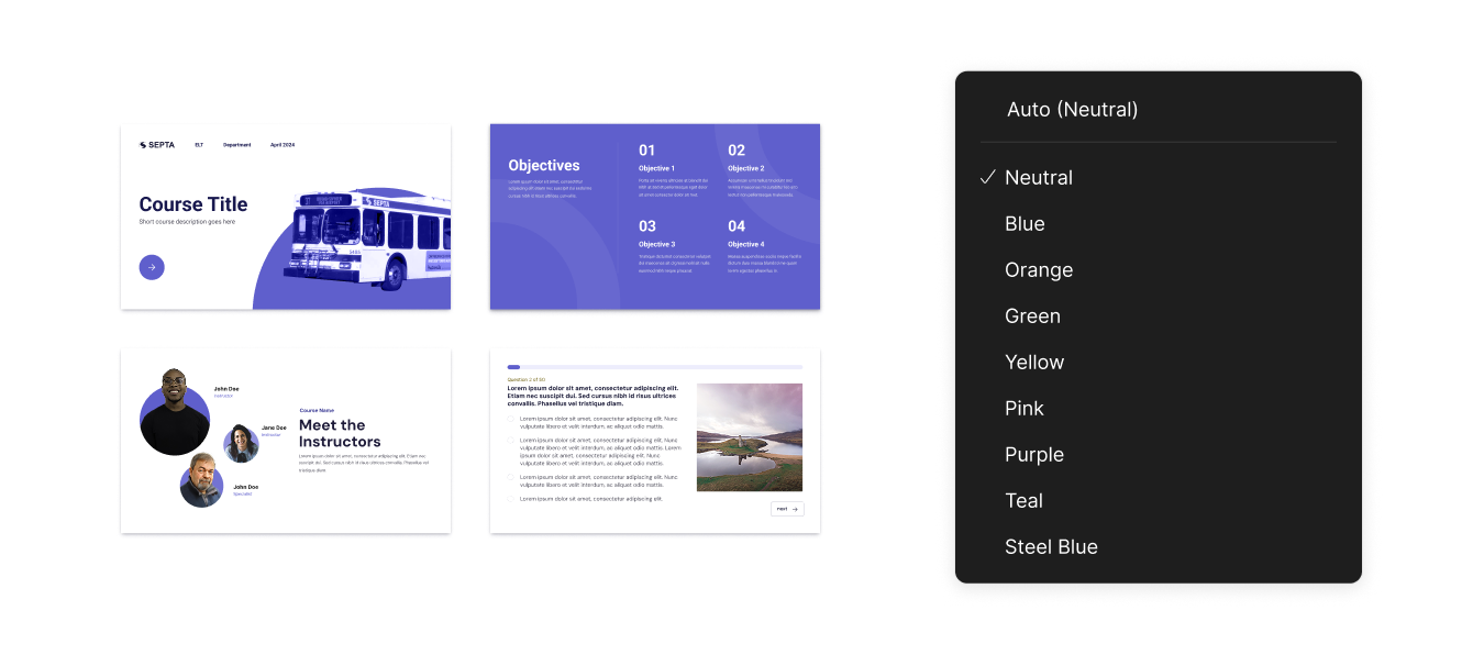
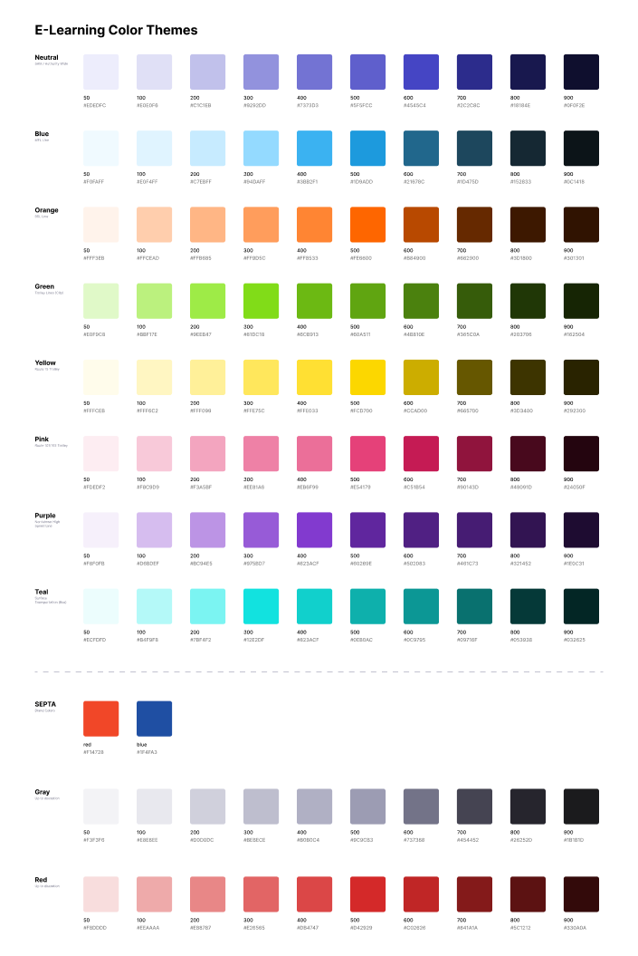
In 2024, SEPTA underwent a major rebrand, introducing SEPTA Metro for its subway and trolley lines. This brand refresh became the source of truth and inspiration for the branding of the internal design system, tying course colors to transportation method.
Training extended beyond subway and trolley operations, however, making it necessary for the design system to account for SEPTA’s full range of service modes and employee types. I introduced two additional color themes for bus and regional rail (each derived from existing color associations already used within SEPTA’s system), and a separate, neutral system color for company-wide training such as compliance and corporate training, ensuring broader applicability without diluting established line-specific meaning.
eLearning modules require prolonged reading, scanning, and comprehension. DM Sans exhibits wider apertures, more open counters, and softer stroke transitions, perfect for reducing visual fatigue during extended online sessions.
Using Microsoft’s Fluent icon set provided a consistent visual language. Custom icons were created and adapted to align with Fluent’s visual conventions, ensuring that mode-specific symbols and operational concepts felt native to the system rather than visually or semantically out of place.
Storyline courses are built on a 16:9 slide format. A 5 column/row grid was established to align with this layout, providing sufficient structure to support varied content types while remaining flexible enough for instructional pacing and interaction.
The system uses a spacing scale based on multiples of four, with 2px reserved as the minimum unit for fine adjustments such as dividers and borders. This approach maintains visual rhythm and alignment across layouts with enough precision to handle dense instructional content.
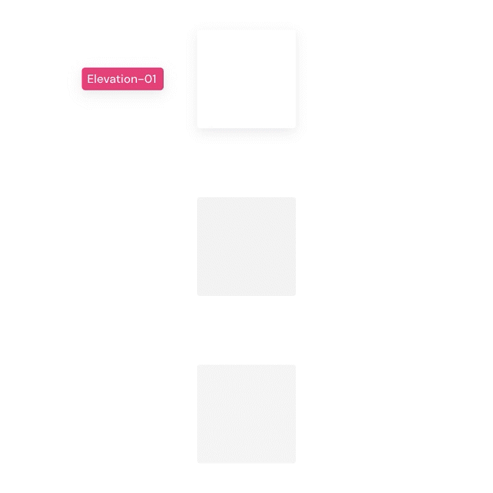
Elevation 01 was reserved for interactive elements that needed subtle emphasis, Elevation 02 was used for overlays and layered content, and Elevation 03 was used for feedback and system messaging.
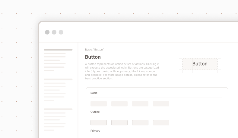
Navigational elements are the most important piece of UI in instructional content, as it guides the user from one stage to the next. Buttons within the system needed to communicate function without obstructing the user from content. Standardizing buttons and menus reduced ambiguity around expected actions and helped learners move through courses without re-learning interaction patterns from screen to screen.
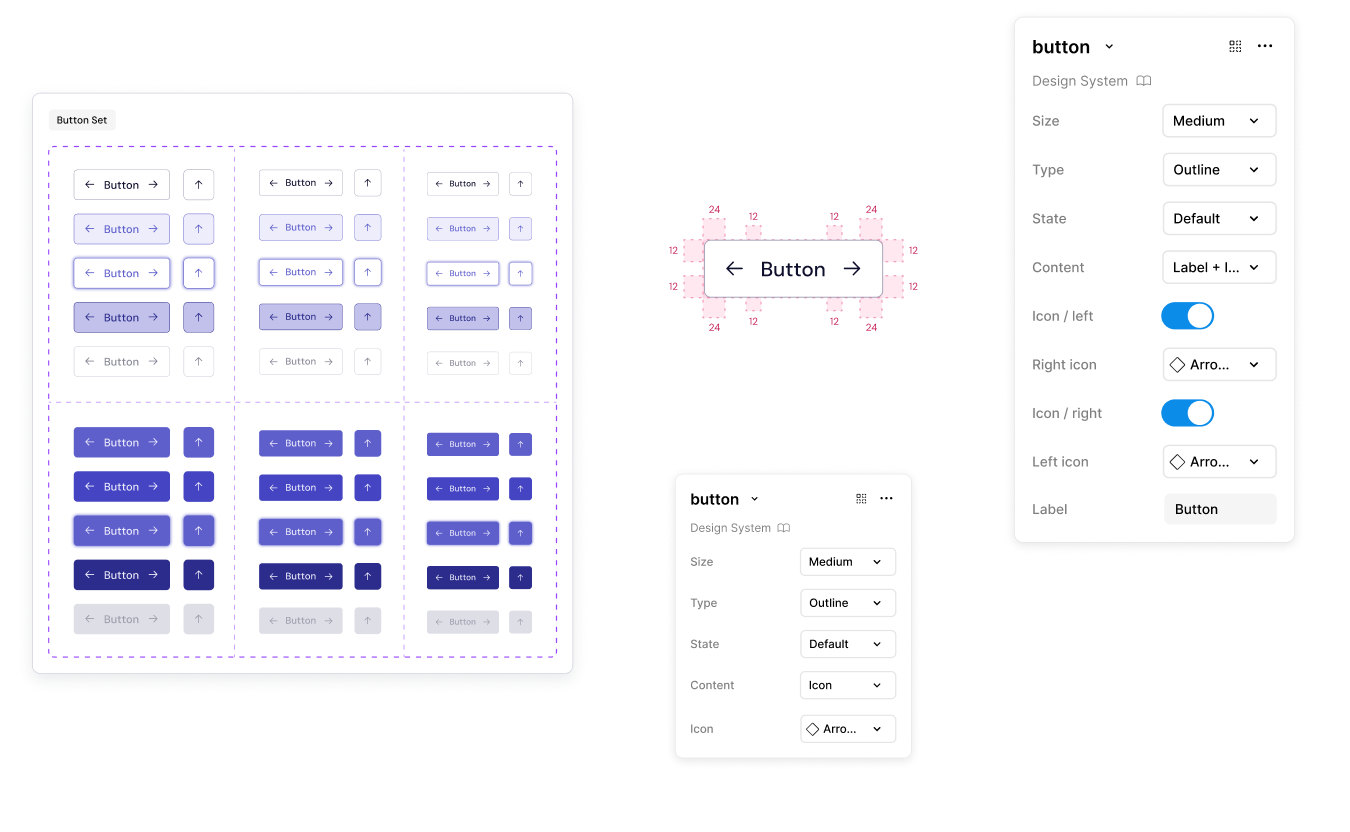
Five button states were defined and used across all course types to clearly signal behavior. This consistency helped learners understand what actions were possible at any moment and reduced uncertainty during navigation and assessments.
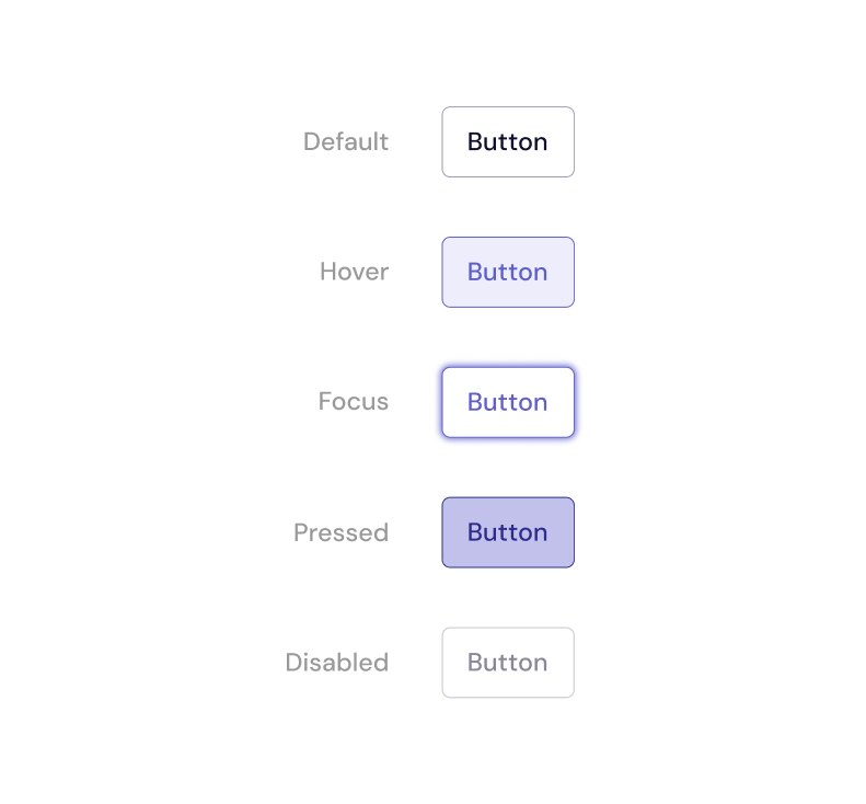
Button styles were limited to three visual treatments to maintain clarity and hierarchy across interactions. Outlined buttons were used for primary actions, filled buttons for secondary actions, and text buttons for low-emphasis or inline actions.
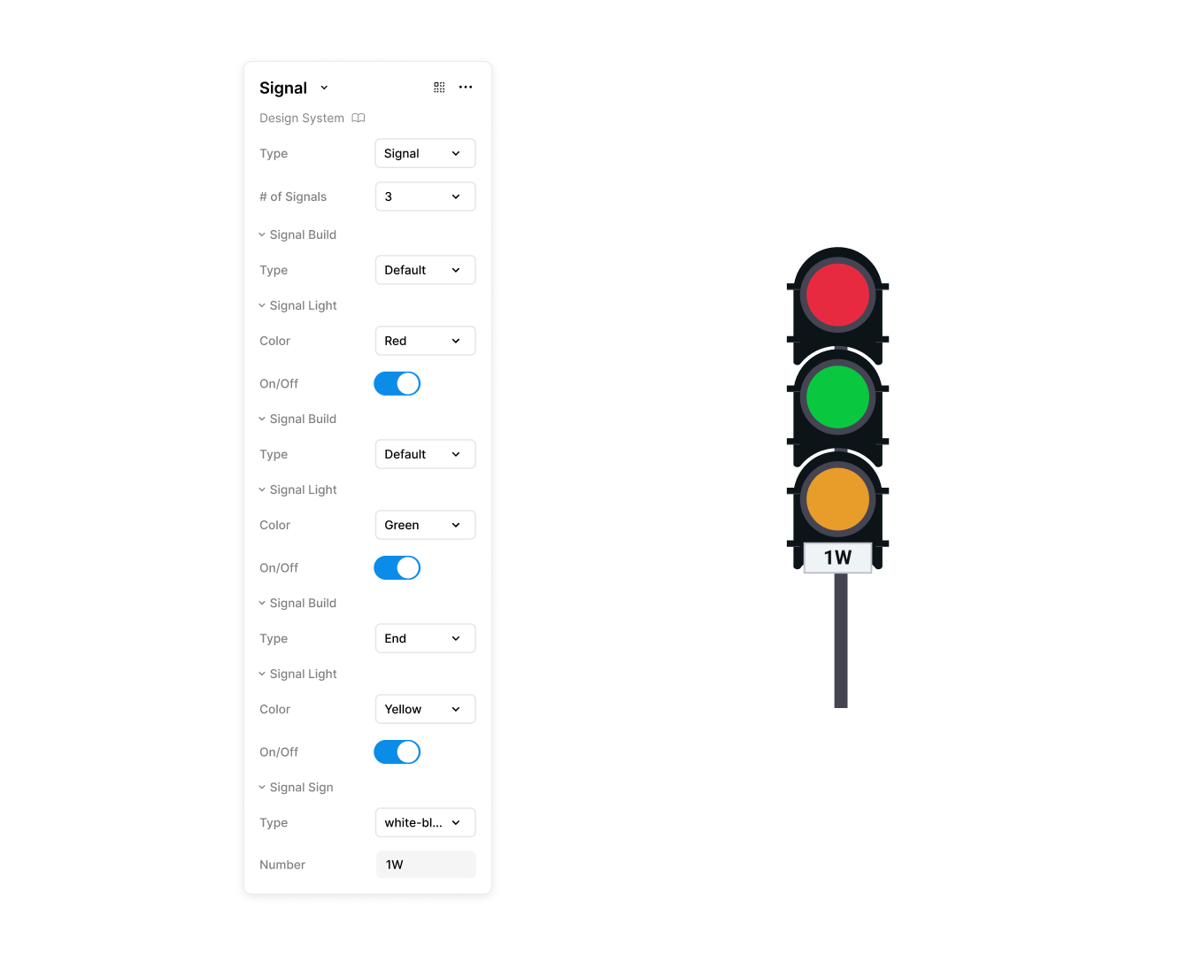
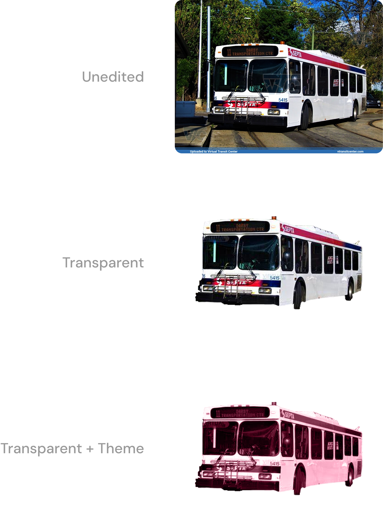
Training courses relied heavily on interaction, requiring a wide range of visual assets, from static imagery to complex, simulation-based graphics. Prior to standardization, these assets were difficult to source, time-consuming to create, and inconsistently applied, making graphics one of the most labor-intensive parts of course development.
I digitized common training graphics into reusable interactive components and established a flexible system that allowed designers to customize them to meet course-specific and animation needs. This approach reduced asset management overhead and ensured interactive elements remained consistent.
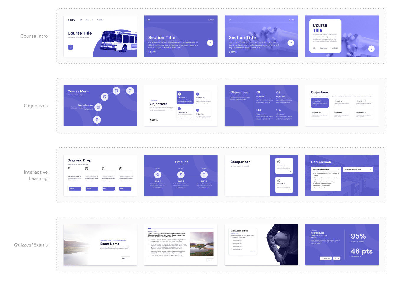
Templates were created based on slide patterns that appeared repeatedly across SEPTA’s courses. By formalizing these commonly used layouts, designers could start from a proven structure rather than rebuilding slides from scratch or copying and modifying content from other files.
Rather than encoding color directly into components, these values were turned into variables that could be applied consistently across layouts and variants.
Our team consisted of seasoned learning experience designers who had been using a simple design system despite not necessarily having a ux name for it. Designers on the team were creating fresh graphics for each course within Articulate Storyline, which decreased efficiency. Before creating the documentation for this design system, I kept the workflow and experience of our designers in mind.
Separating documentation by environment ensured that guidance remained relevant to where decisions were actually made, reducing translation errors between design and build.
In Figma, foundations were defined to aid designers with creation of new components, while Storyline documentation focused on how those components were assembled, configured, and constrained during course production.
Color and typography guides were defined in Figma and print for designers to reference.
Standards for images depended on the image type (decorative or instructional), but fell under three categories:
Clearly defined guidelines and design principles give context to the rationale behind the design.
Themes and templates were built directly in Storyline 360 from the design system defined in Figma, ensuring design guidance translated clearly into course builds without ambiguity.

Integrating the design system directly into Storyline significantly reduced course creation time by removing friction from the build process. The team no longer relied heavily on a digital designer to enforce consistency or rebuild assets, and learning experience designers had greater autonomy to create courses independently.